In this article, I will explain what a funnel plot is, based on their use in meta-analyses, and discuss what they show.
What is a funnel plot?
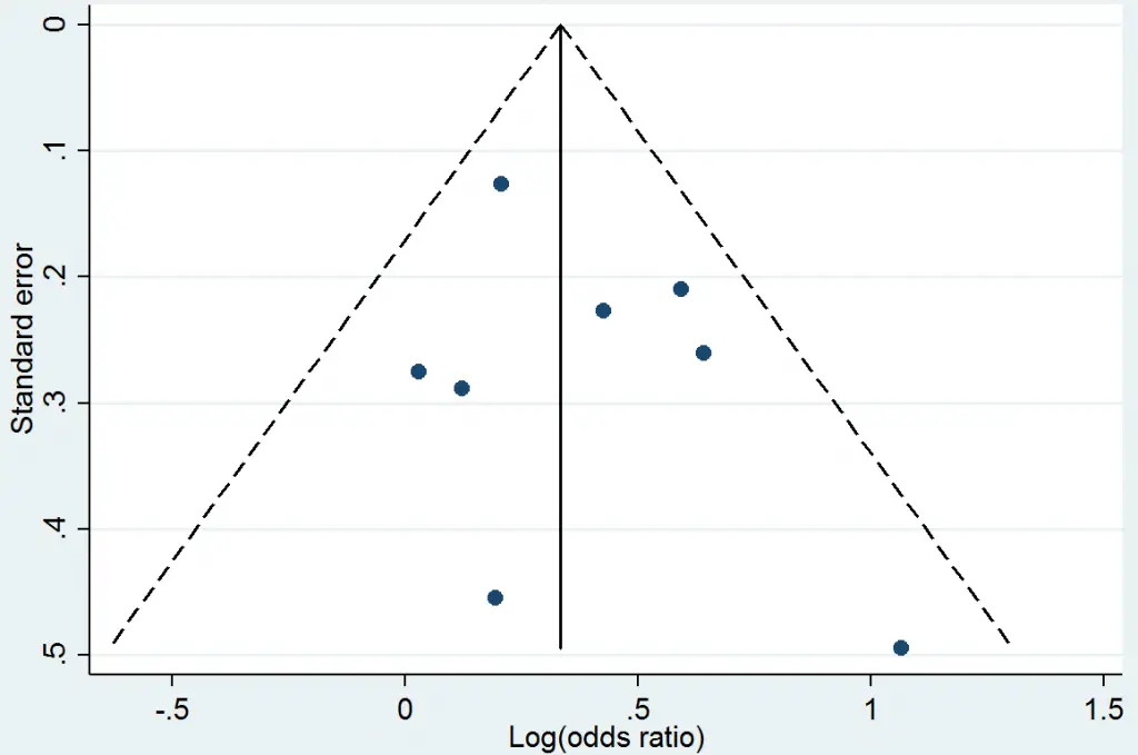
A (Begg’s) funnel plot is a scatterplot used in meta-analyses to visually detect the presence of publication bias. An example of what a typical funnel plot looks like is presented below.

Significant results are published more frequently than negative findings. Thus, including more of the former could naturally sway the overall findings of the meta-analysis. An appropriate meta-analysis therefore includes all of the relevant studies, regardless of their findings. Other sources of bias include language, i.e. those written in English have a tendency to be included as opposed to other languages.
Results of the Egger’s test are sometimes quoted alongside the funnel plot as a statistical measure of publication bias.
How to read a funnel plot
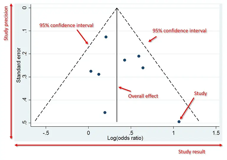
Below is an annotated version of the example funnel plot. The plot displays the studies results (x-axis) and precision (y-axis). In the example above, the results are odds ratios (ORs) and the precision is the standard error of the OR. Each dot of the plot represents a separate study. The above example also has two dotted lines either side which represent the pseudo 95% confidence intervals. The middle solid line indicates the overall effect from the meta-analysis.
 Usually, larger studies cluster around the top of the plot, whilst smaller studies are spread across the bottom of the plot.
What is an ideal funnel plot?
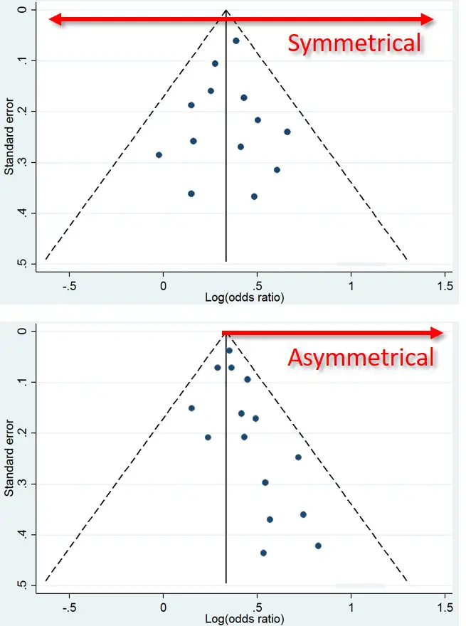
An ideal funnel plot is one where the included studies have scattered either side of the overall effect line in a symmetrical manner (see below). Severe asymmetry to either side, however, is an indication that publication bias may be present. This can also be confirmed is the Egger’s test produces a P value less than 0.05 (assuming the level of significance is set at 0.05).


well described
wonderfully explained
crystal clear explanation, thanks!
Fantastic.
You nailed it.
Simple and to the point. Great teacher