In this tutorial, I will show you how to interpolate a standard curve by using GraphPad Prism. For this example, I have performed an ELISA experiment where I have known concentrations of standards and their absorbance values, as well as some test samples.
The aim of this task is to determine the concentration of the test samples by using their abosrbance values and interpolating this from the standard curve.
Setting up a new data sheet
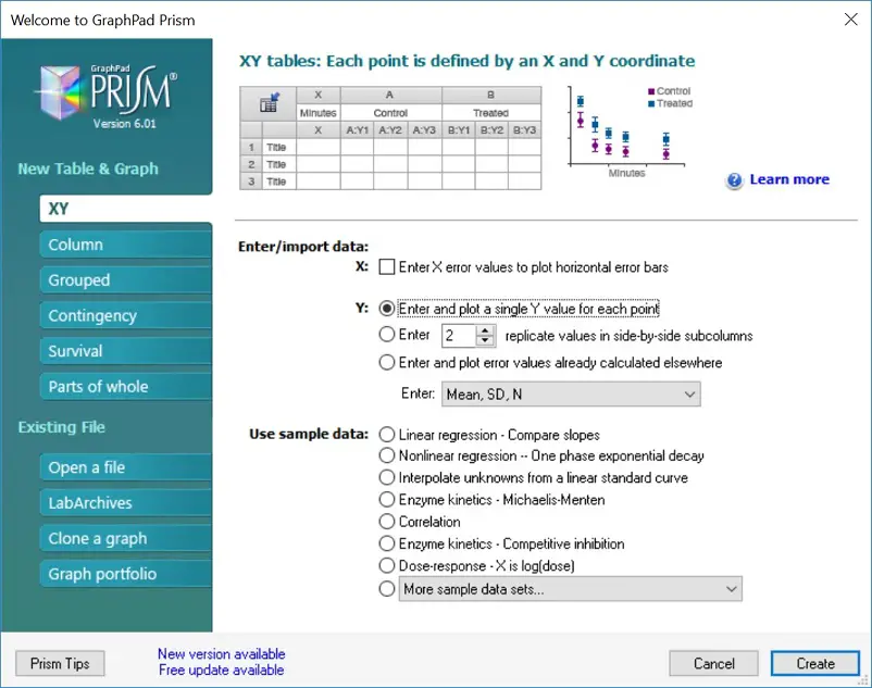
When prompted in GraphPad, select an ‘XY‘ type of Table and Graph sheet. Then, under the ‘Enter/import data’ header, select the option ‘Enter and plot a single Y value for each point‘. Then click the ‘Create‘ button to open the new sheet.
Example data
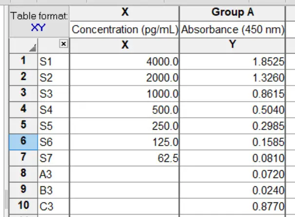
As mentioned, for this example I will use data generated from an ELISA experiment. In the ‘X‘ column, enter the known concentrations of the standards. The corresponding absorbance values then go in the first ‘Y‘ column. Under the standards, enter the test sample absorbance values, leaving their concentration values blank.
Note, the absorbance values I have entered into GraphPad have already been background-corrected. Thus, simply remove the background absorbance value from all of the samples, including the controls. There is no need to include the blank/background sample in the GraphPad sheet.
The image below shows what the data sheet looks like for this example. The standards are in rows 1 – 7 and the test samples are in the rows after this.
Interpolating a standard curve
Now we are ready to interpolate the standard curve using GraphPad. To do this, simply follow the steps below.
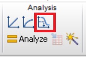
1. With the data sheet open, find the ‘Analysis‘ ribbon at the top and click the ‘Interpolate a standard curve‘ button. Or, go to ‘Insert > New Analysis …‘ and select the ‘Interpolate a standard curve‘ option under the ‘XY analyses‘ header.
 2. In the new window, you need to tell GraphPad what type of a standard curve you have. In other words, what is the relationship between the concentrations and the absorbance values, for example.
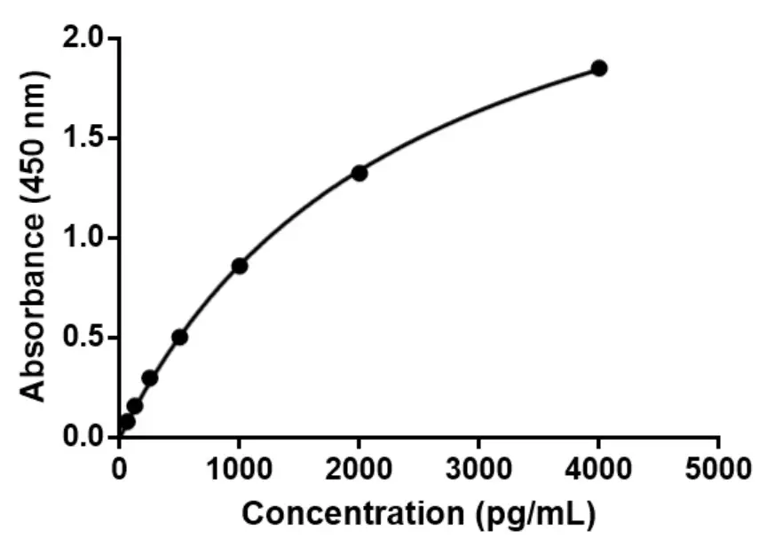
For this example, my standard curve exhibits a hyperbola relationship, so I will select the ‘Hyperbola (X is concentration)‘ option.
If you are unsure which one to select, simply select an option from the list and click the ‘Details…‘ button to view a graphical representation of what each one looks like.
3. Make sure the ‘Report each interpolated value with its 95% confidence interval‘ is ticked. This will ensure the concentrations for our test samples are calculated. I also like to untick the ‘Plot curve with 95% confidence band‘ option.
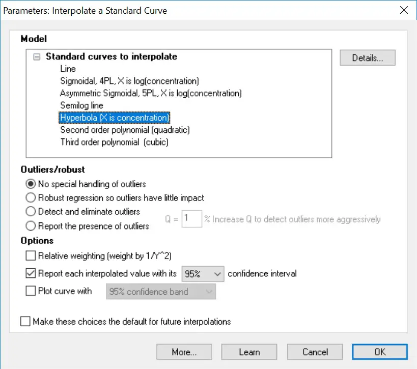 Then click the ‘OK‘ button to run the analysis.
The output
You should now notice a few result sheets and a graph have been created for you.
In the ‘Interpolated X values‘ results sheet you will find all of the calculated concentrations for the test samples. Specifically, these are found in the ‘X‘ column. You will also find the 95% confidence limits for each of these samples.
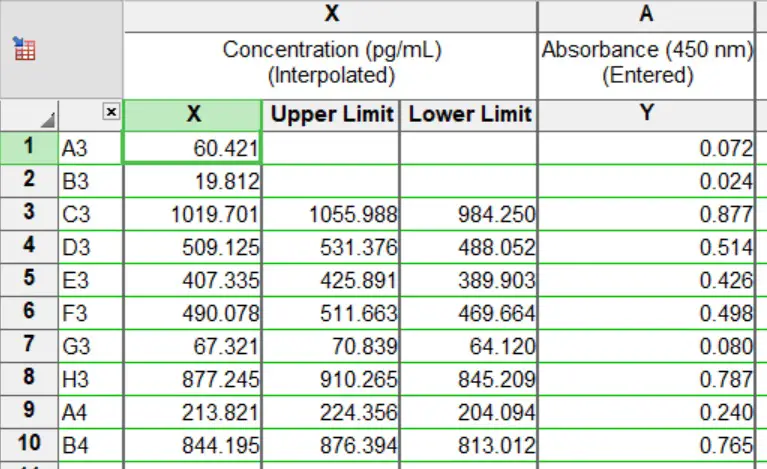 So, for the sample A3, the concentration of this sample is 60.421 pg/mL.
In the ‘Table of results‘ sheet, you will also find additional information about your standard curve, such as the R square value.
Finally, the plotted standard curve can be found in the new graph sheet. Below is the standard curve from this example. Notice how it is not a linear relationship, but rather, a hyperbola relationship.
GraphPad version used: 6


