In this tutorial, I’m going to show you how to create a forest plot in Microsoft Excel.
Forest plots are commonly used to show the results from a meta-analysis. Unfortunately, there is no standard forest plot graph option inside Excel.
Fear not! As I’ve put together a step-by-step guide on how to create a forest plot in Excel, and it’s easier than you think.
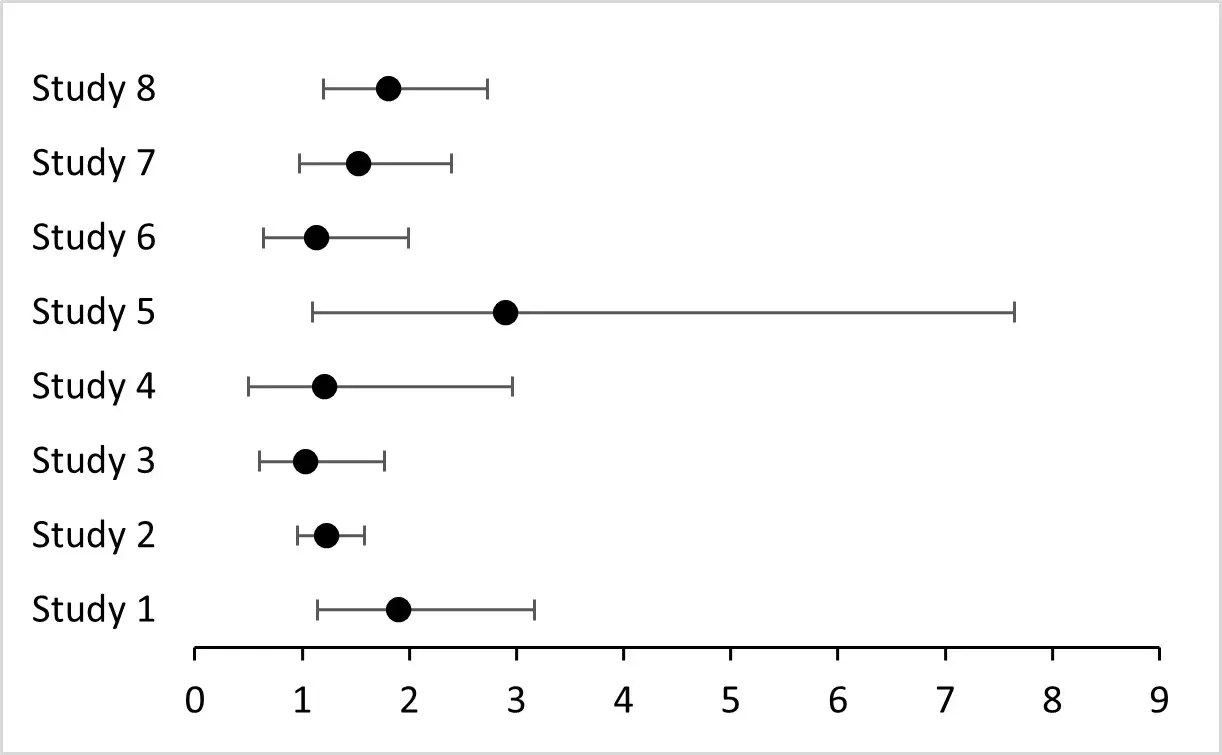
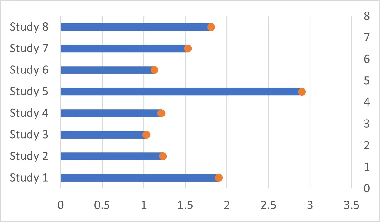
Here’s the exact graph I’m going to show you how to create:
My example data
For this example, I will be using the following example data.
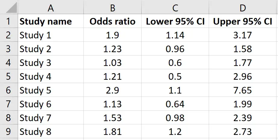
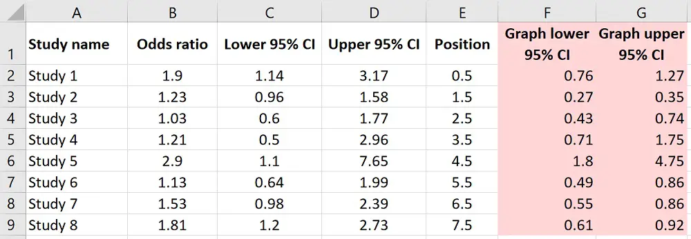
- Column A – These are the placeholders for the study name. Usually in forest plots these are the names of the first author of the paper, followed by et al
- Column B – The study effect size. There are many types of effect sizes you can use, the most common are usually odds ratios or mean difference. In this example, I will be using the odds ratio
- Column C – The lower 95% confidence interval for each effect size
- Column D – The upper 95% confidence interval for each effect size
How to create a forest plot in Excel
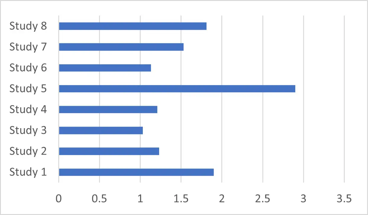
1. Create a clustered bar
First, highlight the first two columns containing the study name and the effect size.
Next, go to Insert and in the Charts area, select to insert a Column or Bar Chart. Then, select the 2-D Clustered Bar option. You should have a bar that looks like this:
Sometimes, when you have negative effect size values, your labels may overlap your bars. If this is the case, you can move the labels to the left of the axis.
To do this, right-click on the labels on the graph and select Format Axis. This will open a new sidebar to the right called Format Axis.
Scroll down and select Labels. Then change the Label Position to Low. Hopefully, this should solve your issue.
2. Add in the row positions
Next, we need to create a new column of data in our sheet that will be used to specify where to place the scatter plot points on our forest plot – this will make more sense shortly.
For now, create a new column in the sheet called Position (or whatever name you like).
Then, starting at 0.5, go down in intervals of 1 until you reach the last study.
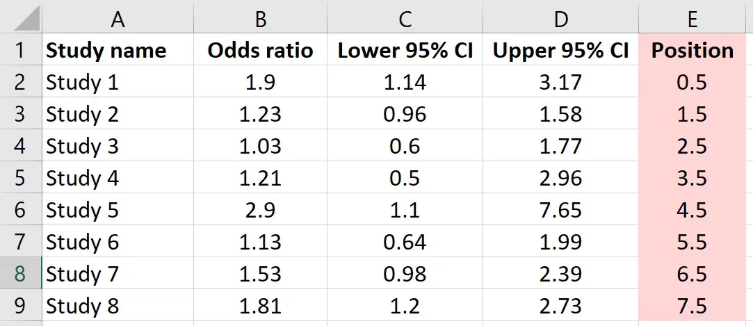
Note, that the study with the smallest Position value will be placed at the bottom of the forest plot.
3. Add a scatter plot to your graph
The next step is to use these new Position values to create a scatter plot, so it looks more like a forest plot.
So, right-click on the graph and go to Select Data.
Then you want to add a new Series.
For now, just leave the series name blank and do not change the series values. Then click OK, and OK again.
Next, we need to change this new orange bar to be a scatter plot rather than a bar chart.
To do this, right-click on the orange bar and select Change Series Chart Type.
For the second series we just created, change this to be a Scatter, then click OK.
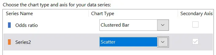
Now you should see a single orange scatter point is on the graph.
To add in the effect size data, right-click on the new point and go to Select Data.
Select Series 2, and click Edit.
- Series X values – Enter the cells containing the effect size data
- Series Y values – Select the values in the Position column we recently created. Basically, these values just specify how high up the Y axis the scatter points should sit.
You should now see the effect sizes have been added to the new series and can be seen as scatter points.
4. Remove the clustered bar graph
Next, we can remove the clustered bar graph, as we don’t need to see this.
Since we still want to see the study names for our labels to the left of the axis, we cannot simply click on the bars and delete them. Instead, click on any bar to select them all, and then go to Format and change the Shape Fill to No Fill.
Another thing I suggest you do is to remove the axis on the right, which corresponds to the Positions, as we don’t need to see this. To delete this, simply click on the right axis and press delete on your keyboard.
5. Add error bars (whiskers) to the scatter points
Next, let’s add the error bars to the scatter points. In this case, the error bars will represent the 95% confidence intervals.
Before we can do this, we need to calculate the difference between the effect size, so the odds ratio for my example, and the lower and upper 95% confidence interval values.
To do this, I will create two new columns in my sheet.
- Graph lower 95% CI – Subtract the cell containing the actual lower 95% confidence interval from the effect size (odds ratio)
- Graph upper 95% CI – Subtract the cell containing the effect size (odds ratio) from the actual upper 95% confidence interval
Repeat these calculations for all the studies in your sheet.
Now we are ready to create the error bars.
To do this, select any of the scatter points to select them all, then go to Chart Design>Add Chart Element>Error Bars and select More Error Bars Options.
You will see that it looks a bit of a mess at the minute, but don’t worry!
We don’t need the vertical error bars, so select one to select them all and press delete on your keyboard to remove them. Now we are left with just the horizontal error bars.
Select one of the error bars to select them all.
Then, in the Format Error Bars sidebar to the right, scroll down and select Custom from the Error Amount.
Now click on the Specify Value button.
- Positive Error Value – Enter the new upper 95% confidence interval data we just created (Graph upper 95% CI)
- Negative Error Value – Enter the new lower 95% confidence interval data we just created (Graph lower 95% CI)
You should now see the correct error bars on the points.

6. Format the forest plot
Change the scatter points to black
There are a few more things we can do before we finish. The first is to change the colour of the scatter points to black, as traditionally forest plot points are solid black circles.
To do this, right-click on a point on the graph and select Format Data Series.
In the right sidebar, select Fill and Line and go to Marker.
Under Fill, change the colour to black. Also, change the border colour to black too.
Remove Y axis border
Another thing I suggest is remove the Y axis border.
To do this, click to select the Y axis and then go to Format>Shape Outline and then select No Outline.
Remove major gridlines
As well as removing the Y axis border, I also recommend removing the major gridlines.
Simply select a major gridline to select them all and press delete on your keyboard.
Adjust the X axis
Next, I will add an outline to my X axis so this becomes visible.
To do this, select the X axis and go to Format>Shape Outline and select black.
I will also adjust the X axis by right-clicking on it and selecting Format Axis.
In the Format Axis sidebar, I will change the Major Units to be 1 and select to show the Major Tick Marks on the Outside.
Add a vertical line at X=1
Lastly, it is common for forest plots that present odds ratios to add a vertical solid line that passes through X=1.
There is no easy way to do this on Excel, so the best method I’ve found is to just manually add a vertical line yourself by going to Insert>Shapes, and then select the straight line option.
A tip here is when your clicking and dragging to add the line, keep your finger on the shift key to ensure the line will be straight.
Once you have the desired length, you can move it to be positioned at X=1 and change the shape outline to black.
And with all those changes, you should be left with a lovely forest plot.
How to create a forest plot in Excel: Final words
After following this tutotial, you should now be able to create a forest plot in Microsoft Excel.
Forest plots are not a standard graph in Excel; however, with a little bit of rejigging, you can easily create a publication-worthy forest plot in just a few minutes.
Microsoft Excel version used: 365 ProPlus
