In this tutorial, I’m going to show you how to create a quantile-quantile plot, otherwise known as a QQ plot, in Microsoft Excel.
QQ plots are great visual aids to inspect the distribution of your data. Most commonly, QQ plots are used to see if the data follows a normal distribution.
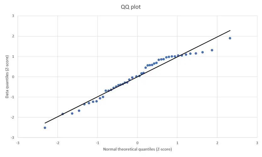
Here’s a sneak peak at the end product.
How to create a QQ plot in Excel
In this example, I have a sample containing 49 different data points. These data points have been entered into the first column of my Excel sheet.
What I want to do for this example is to create a QQ plot in Excel to determine if my sample data has a normal distribution.
Step 1: Rank the data
The first step to create a QQ plot in Excel is to rank the data in ascending order (from smallest to largest). This is really easy to do with the RANK AVERAGE function.
=RANK.AVG(number, ref, [order])
- number – The cell containing the data point you want to rank
- ref – The range of cells containing the complete data
- [order] – Enter 1 to rank the cell in ascending order
Here’s what the formula looks for my example.
=RANK.AVG(A2,$A$2:$A$50,1)
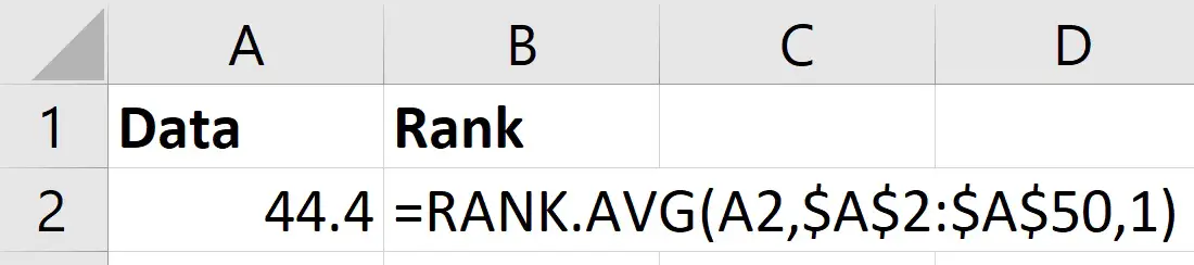
Notice that I have also included a $ symbol before the column letters and row numbers in the ref part of the formula. This is because I want these particular cells to remain constant when I copy the formula down.
Once running this formula, you need to copy the formula down to repeat the process for all the data points.
You should be left with a ranking order of your data.
Step 2: Calculate the percentiles
For the next step, you need to calculate the percentile value of the ranks.
To do this, you simply take the rank of the data point and subtract 0.5 from it. You then divide this answer by the number of data points in your sample.
Here’s an overview for what the formula will look like in Excel.
=(rank-0.5)/COUNT(data)
- rank – The cell containing the rank
- data – The range of cells containing the complete data
And here’s what this looks like for the first rank in my data.
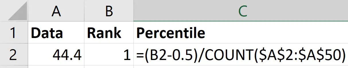
Within the COUNT function, notice that the range of cells are also locked (contain the $ symbols).
As with the first step, you want to repeat the function so that all the percentile values for all your ranks are calculated.
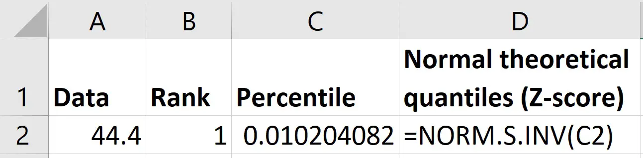
Step 3: Calculate the normal theoretical quantiles
The next step to calculating the QQ plot in Excel is to work out the normal theoretical quantiles.
Specifically, these quantiles are Z-scores based on a normal distribution, where the mean is 0 and the standard deviation is 1.
To do this, I will use the NORM.S.INV function.
=NORM.S.INV(probability)
- probability – The cell containing the percentile
Simply add in the cell containing the percentile values calculated in the previous step.
Step 4: Calculate the data quantiles
Now we have the normal theoretical quantiles, the final calculations we need are the Z-scores for the quantiles based on the original data.
To do this, I will use the STANDARDIZE function to create Z-scores.
=STANDARDIZE(x, mean, standard_dev)
- x – The cell containing the data point
- mean – The average value of the data
- standard_dev – The standard deviation of the data
Note, calculating Z-scores in Excel is discussed in more detail in this post.
For the mean and standard_dev parts of the formula above, you can use the AVERAGE and STDEV (or STDEV.S) functions, respectively.
Here’s what the formula looks like for my first data point in my example.
=STANDARDIZE(A2,AVERAGE($A$2:$A$50),STDEV($A$2:$A$50))
Again, the $ symbols are included to lock the range of cells inside the AVERAGE and STDEV functions. The formula is then copied down to calculate the Z-scores for all my data.
Step 5: Create the QQ plot
Now we have everything we need to create the QQ plot in Excel.
The QQ plot is simply a scatter plot with the normal theoretical quantiles (X axis) against the data quantiles (Y axis).
To create the plot, go to Insert>Insert Scatter>Scatter.
How to adjust the axes
One thing you will probably want to do is adjust the axes, so that they are not placed in the middle of the graph.
To do this, right-click on the graph and select Format Chart Area.
Use the dropdown menu to select either Horizontal (Value) Axis or Vertical (Value) Axis.
In the Axis Options, I recommend adjusting where the axis crosses by defining your own Axis value.
How to add a linear trendline
A common feature of a QQ plot is to add a linear trendline to the graph to make it easier when interpreting the results.
To do this, with the graph selected, go to Chart Design>Add Chart Element>Trendline>Linear.
How to interpret a QQ plot
To interpret the QQ plot, you want to look at the data points on the graph and how they fit on the linear line.
If the data has a completely normal Gaussian distribution, then all data points will fit perfectly on the linear line. The data will also follow the linear line in a 45 degree angle.
Looking at my example, I can see that the majority of my data points are either on or are close to the linear line.
So, I’m fairly confident that I have an approximately normal or Gaussian distribution.
It’s also worth plotting a frequency histogram to explore normality further.
How to create a QQ plot in Excel: Final words
In this tutorial, I have shown you how to create a QQ plot in Microsoft Excel. I’ve also shown to you to interpret the results of the plot.
To create a QQ plot to assess data normality, you must manually calculate the normal theoretical quantiles and plot these in a scatter plot against the actual data quantiles.
Microsoft Excel version used: 365 ProPlus
