In this tutorial, I will show you how to add error bars to graphs in Microsoft Excel. Specifically, I will be adding error bars onto bar graphs.
Here’s the end product:

The error bars for this example will be the standard deviation, or SD.
My example
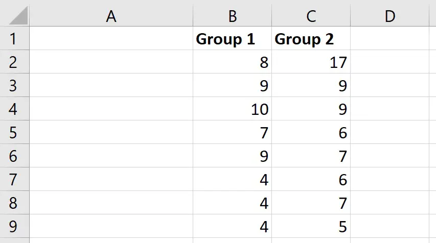
For this example, I have some data entered for two groups. Within Excel, each group’s data is entered into two columns.
What I want to do is to create a simple bar graph and add error bars that represent the SD.
How to create the bar chart
The first thing I need to do is to calculate the average for these two groups.
To do this, I will select an empty cell, and enter:
=AVERAGE(cell1:cell2)
In this case:
- Cell1 – is the first cell containing data in the group
- Cell2 – is the last cell containing data in the group
Here is what it looks like for my example.

To quickly copy this formula across to calculate the average of the next group, click on the cell containing the formula and click and drag on the little black square.
So, now we have our averages, next we need to calculate what we want our error bars to represent.
There are many types of statistics you can use here, such as:
- Confidence intervals (CIs)
- Standard deviation (SD)
- Standard error of the mean (SEM)
For this example, I will calculate the SD.
If you are interested in calculating the standard error of the mean or confidence intervals in Excel, then check out my previous guides.
To calculate the SD, I will select an empty cell, and enter the formula.
=STDEV(cell1:cell2)
As before, ensure the range of cells containing the data is selected.
Again, copy this formula across to repeat this for the other groups.
Now, we have everything we need to create a simple bar graph.
To create a simple bar graph, I will highlight the average values of my two groups, then I will go to Insert, select the bar chart icon and choose a 2D graph.
So, now we have a simple bar chart showing the average values for the two groups.
How to add error bars in Excel
I will now add the error bars to the bar graph.
There are a few ways you can add the error bars in Excel.
With the graph selected, you can go to Add Chart Element>More Error Bars. Or, simply select the graph, click on the plus icon in the corner of the graph and select to show error bars.

Now, you should see the error bars with the Format Error Bars sidebar open to the right. If you don’t see this sidebar, simply double-click on the error bars in the graph.
There are a few options in this sidebar, for example, you can choose if you want the error bars above and below the middle point, or just select one or the other. Also, you can change the end cap appearance of the error bars.
But, the thing we are interested in is the Error Amount.
In Excel, you can set this to be different things, but depending on how you have set up your data in the data sheet, it is always best to select the Custom option.
Now, select the Specify Value button.
In the new window, click on the button next to the Positive Error Value box and click and drag to select the error values, in this case they are the SD values. It’s important that you select the data in the same order as is plotted on the graph. Then press Enter.
Now, repeat the steps for the Negative Error Value.
Finally, click OK.
As you can see, error bars have now been added to the graph, which indicate the SD.
Final words
In this quick tutorial, you have learnt how to add error bars to graphs in Excel.
All you have to do is calculate what you want the error bars to be, e.g. SD, and then add this to the graph as a custom error amount.
Microsoft Excel version used: 365 ProPlus

")
