In this tutorial, I will show you how to create a correlation matrix by using Microsoft Excel. I’ll also show you how to colour code the cells so it’s easy to visualise the results.
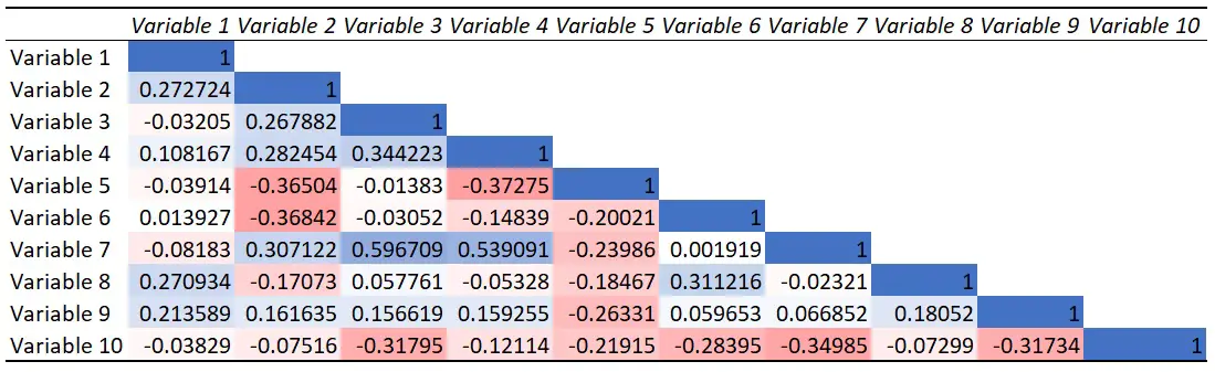
Below is the correlation matrix I will show you how to create.
Example data
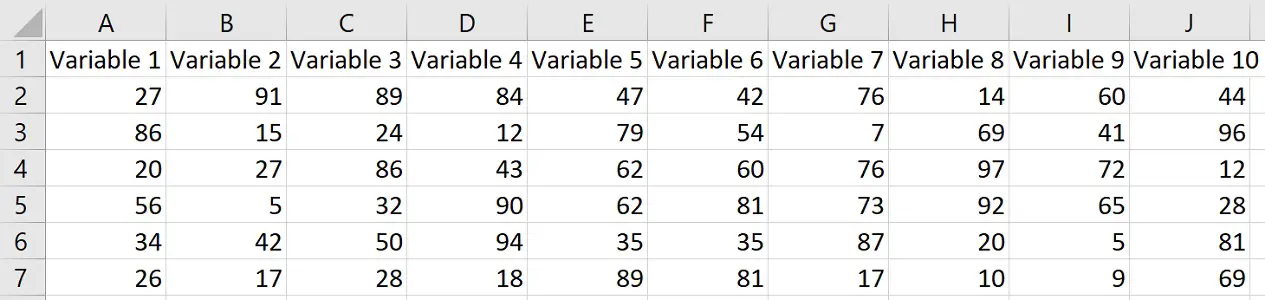
For this example, I have 10 different variables; each variable has been entered into a different column.
For each variable I have 19 different values – these are just random numbers for the purpose of this example.
The screenshot below shows the top section of my data sheet.
How to create a correlation matrix in Excel
What I want to do is to create a correlation matrix, which contains the Pearson correlation coefficient values between each of my 10 different variables.
1. Install the Data Analysis ToolPak
Perhaps the easiest way to create a correlation matrix in Excel is to use the Data Analysis ToolPak. This is an add-on created by Microsoft to provide data analysis tools for statistical analyses.
To install this add-on, go to File>Options.
Then click on Add-ins.
At the bottom, you want to manage the Excel Add-ins, and click the Go button.
Then, ensure you tick the Analysis ToolPak add-in, and click OK.
Now, when you click on the Data ribbon at the top, you should see a Data Analysis button in a sub-section called Analyze.
Now we are ready to create the correlation matrix.
2. Use the Data Analysis ToolkPak to create the correlation matrix in Excel
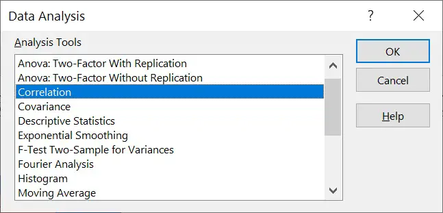
To create the correlation matrix, go to Data>Data Analysis.
From the list, select the Correlation option and click OK.
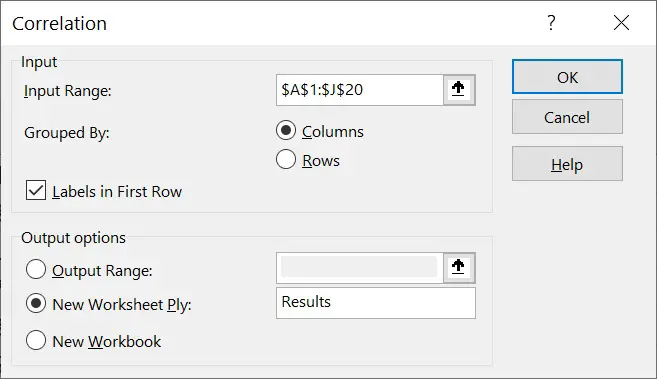
Now enter the following:
- Input Range – Enter the cells containing all of the data to include in the analysis
- Grouped by – If your data are organised into different columns, then select the Columns option; if your data are organised into different rows, then select the Rows option instead
- Labels in First Row – Tick this if you have cells containing label names at the top of your data set
Under this, there are also three output options to select from for where you want the results to be entered:
- Output Range – Select an area in the current sheet where you want to results to be placed
- New Worksheet Ply – Save the results in a new worksheet, and give it a name
- New Workbook – Save the correlation matrix in a completely separate Excel file
For my example, I’ve selected the second option to have the correlation matrix returned in a new sheet.
Finally, press the OK button to run the analysis.
Interpreting the results of the correlation matrix
You should now see a correlation matrix has been created.
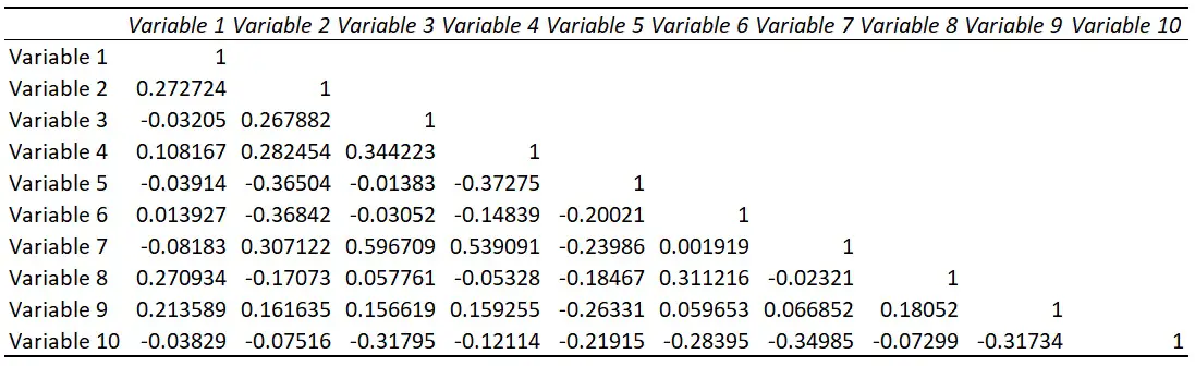
The top row and first column will list each of the variables entered into the test.
The numbers in the table represent Pearson correlation coefficient values.
So, in my example, the correlation coefficient value for the relationship between Variable 1 and Variable 4 is 0.108.
The correlation coefficient is a value that ranges from +1 to -1.
A value of 0 means there is no linear correlation between the two variables.
A value of +1 means there is a perfectly positive linear correlation between the two variables; so, as one variable increases, so does the other.
You can see in the matrix that anytime there is a correlation between the same variable, the correlation coefficient value is 1. That’s because if you plot two variables with exactly the same values against each other, then you will always get a perfectly positive linear correlation between the two.
A value of -1 means there is a perfectly negative linear correlation between the two variables. So, as one increases, the other tends to decrease.
Also note that only half the matrix is complete, that is because the results would be the same if these empty cells were calculated.
[Optional] Use the CORREL function to calculate the Pearson correlation coefficient
If you would prefer to calculate the Pearson correlation coefficient values yourself, instead of using a matrix, you can do so with the CORREL function.
=CORREL(array1, array2)
- array1 – All cells containing data for the first variable
- array2 – All cells containing data for the second variable
If you wanted to go a step further and calculate a p-value for the Pearson correlation test to see if the result is significant, then I refer to my tutorial on performing a Pearson correlation test in Microsoft Excel.
How to colour code the cells in the correlation matrix
Sometimes, the cells in a correlation matrix are coloured based on their coefficient values. This can easily be done in Excel by using the conditional formatting.
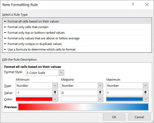
Firstly, highlight all the values in the table, and then go to Home>Conditional Formatting>New Rule.
Select format all cells based on their values as the rule type.
In the rule description underneath, use the dropdown menu to change the style to a 3-color scale.
Then change the colour settings to:
| Minimum | Midpoint | Maximum | |
|---|---|---|---|
| Type | Number | Number | Number |
| Value | -1 | 0 | 1 |
| Colour | Red | White | Blue |
When using this conditional formatting rule, any cells with a correlation coefficient value of -1 will be coloured red. The cells with a value of 0 will be coloured white and the cells with a value of 1 will be coloured blue. And because this is a gradient of colours, any values in between these points will have a shade of colour that represents their correlation coefficient value.
You can of course use different colours; however, these seem to be the most popular choices when colouring a correlation matrix.
Below is the correlation matrix for my example with the conditional formatting applied.
Creating a correlation matrix in Excel: Final words
In this tutorial, I have shown you how to create a correlation matrix in Microsoft Excel.
A correlation matrix can easily be created by using the Data Analysis ToolPak. Once created, you can take advantage of Excel’s conditional formatting colour the cells according to the correlation coefficient values.
Microsoft Excel version used: 365 ProPlus

")
