In this article, I will show you how to perform a simple linear regression test in Microsoft Excel.
Not only will I show you how to perform the linear regression, but I’ll show you how to analyse the outputs of the regression test.
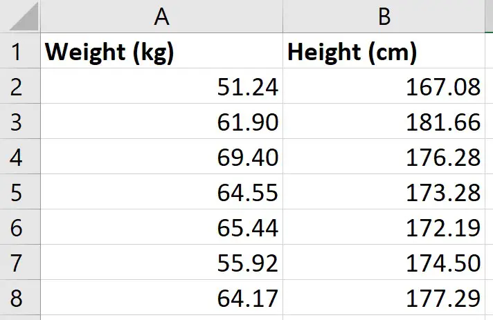
My example data
For this example, I just have two variables of data:
- Weight (kg)
- Height (cm)
I have these measures for 49 different participants; each row represents a different participant.
So, for the first participant, I can see that they had a weight of 51.24 kg and a height of 167.08 cm.
What I want to do is to perform a simple linear regression to see how well the measures of height in my sample can predict the measures of weight.
Installing the Analysis ToolPak
There are a few ways you can perform a linear regression in Excel, but perhaps the easiest method is to use the Analysis ToolPak. This is an add-on created by Microsoft to provide data analysis tools for statistical analyses.
Here are the intrustions for installing the Analysis Toolpak:
- Go to File>Options
- Then click on Add-ins
- At the bottom, you want to manage the Excel add-ins and click the Go button
- Then, ensure you tick the Analysis ToolPak add-in, and click OK
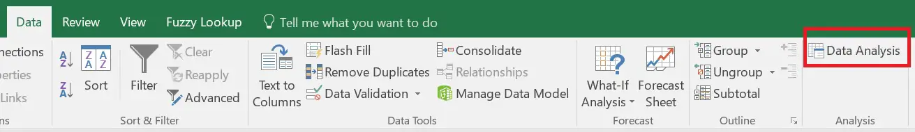
Now, when you click on the Data ribbon, you should see a Data Analysis button in a sub-section called Analyze
We are now ready to perform the linear regression in Excel.
Performing the linear regression in Excel
To perform the linear regression, click on the Data Analysis button.
Then, select Regression from the list.
You must then enter the following:
- Input Y Range – this is the data for the Y variable, otherwise known as the dependent variable. The Y variable is the one that you want to predict in the regression model. For me, this will be the weight data
- Input X Range – this is the data for the X variable, otherwise known as the independent variable. For me, this will be the height data
If you have highlighted the labels of the columns when selecting the data, then tick the Labels options. If you didn’t have any labels when you selected your data, then you should not tick this option.
The next option called Constant is Zero is used if you want the regression line to start at 0, otherwise known as the origin. Doing so would mean there is no Y intercept in the model. Generally, for linear regression, this option is not selected, so I will leave it unchecked for this example.
It is also possible to specify the confidence level for the test. By default, the results will return the 95% confidence intervals without having to change any options. However, if you want to use a different confidence level than 95%, then you need to select this option and enter the desired value here.
Output options
For the Output Options, you can specify where you want the regression results to be placed.
- Output Range – you can highlight where you want the results to be placed in that worksheet
- New Worksheet Ply – lets you place the results in a new worksheet
- New Workbook – lets you save the results in an entirely separate workbook
For my example, I’m going to select the second option and have the results placed in a new worksheet.
Residuals
The final set of options concerns the residuals in the analysis.
- Residuals – will return the list of predicted dependent values, based on the regression line, as well as the residual values for each point
- Standardized Residuals – will return the standardized residuals; these values can be useful when identifying potential outliers
- Residual Plots – will create a scatter graph where the residuals are plotted on the Y axis and the X variable is plotted on the X axis
- Line Fit Plots – will create another scatter graph where the Y and X variables are plotted, but it will also add the predicted Y values onto the graph
Finally, the Normal Probability Plots option plots another scatter plot, which is used to determine whether the Y variable data fits a normal distribution.
Interpretation of the linear regression results
Depending on the options selected in the set-up window, you will have quite a lot of information in the results sheet.
I’ll now break down the output and go through each in more detail.
- Summary Output table
- ANOVA table
- Coefficients table
- Residual Output table
- Residual plot
- Standardized Residuals
- Line Fits plot
- Normal Probability plot
Summary Output table
In the first table called Summary Output, there are some regression statistics from the test.
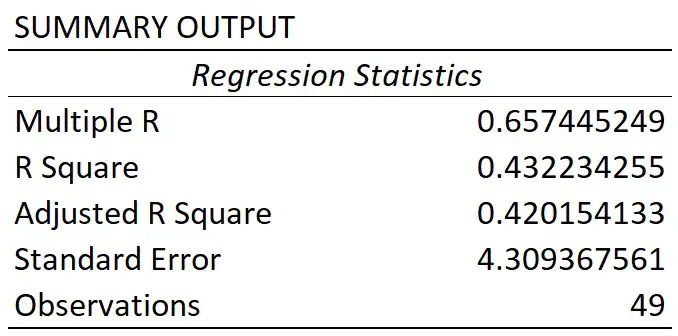
Multiple R
This is the absolute value of the correlation coefficient between the two variables of interest. Briefly, it is a value that tells you how strong the linear relationship is.
A value of 0.65 in this case indicates a fairly strong linear correlation between height and weight measures.
If you’re interested to learn more about correlation, then I suggest you refer to the What is Pearson Correlation post.
R square
You may sometimes see the R square being referred to as the coefficient of determination.
To get this value, you simple square the multiple R value.
The R square value tells you how much variance the dependent variable can be accounted for by the values of the independent variable. Researchers often multiple this value by 100 to get a percentage value.
So, for my example, I can say that 43% of the variance in weight can be accounted for by the height measures. The other 57% of the variance is therefore caused by other factors, such as measurements errors.
Adjusted R square
The adjusted R square takes into account the number of independent variables in the regression analysis, and corrects for bias.
Usually, this value is only relevant when you are performing multiple linear regression, where there are more than 1 independent variables in the model.
Standard error
The standard error of the regression is the average distance that the observed values fall from the regression line.
What’s useful about the standard error is that it is in the same units as the dependent variable. So, here my standard error is 4.31 kg, when rounded. This means, on average, my observed values were 4.31 kg from the regression line.
The smaller the standard error, the more precise the linear regression model is.
Observations
Finally, we have the number of observations. This is just the number of subjects in the test.
So, for my example, I had 49 participants.
ANOVA table
The main thing you will be concerned with when looking at this table is the value under the Significance F header; this is in fact the P value for the regression model.

To be able to interpret this, we need our hypotheses:
- Null hypothesis – there is no linear relationship between the height and weight measures
- Alternative hypothesis – there is a linear relationship between the height and weight measures
If my alpha was 0.05, this means I will reject the null and accept the alternative hypothesis if P≤0.05. The opposite will be true if P>0.05; in this case, I would fail to reject the null hypothesis.
As you can see, the P value (Significance F) for the model was considerably lower than my alpha value of 0.05. So, I can conclude that the linear regression model is significant.
Coefficients table
Let me now move on to the final table of results regarding the coefficients.

The first row displays the results for the intercept, this is the point where the line of best fit (regression line) crosses the Y axis when the value of X is zero.
The second row displays the results for the slope.
For a simple linear regression model, the most basic version of the equation is Y = m.X + b.

Using the information reported from the results, we can then say:
Y = 0.800264.X – 79.599
So, in this example, if we knew a participants height (in cm), we can predict their weight (in kg) by using this equation. For example, if a participant measured 175 cm, the model estimates their height to be 60.45 kg.
Looking back at the coefficient results table, we can see there are other columns which tells us the standard error, as well as the lower and upper 95% confidence intervals, or a different confidence interval if a different confidence level was entered. And these values are for the intercept and slope values.
You will also notice each also has a T-statistic. This value is used to compute the P value.
Again, to interpret this P value we need our hypotheses:
- Null hypothesis – the intercept or slope is 0
- Alternative hypothesis – the slope of the line is not 0
As you can see, both values are less than my alpha of 0.05. However, we usually ignore the P value for the intercept.
For the slope, this means that height is a significant variable that impacts weight in this case.
Residual options
So, that’s an overview of the regression model results, let me know cover the other outputs from the regression test.
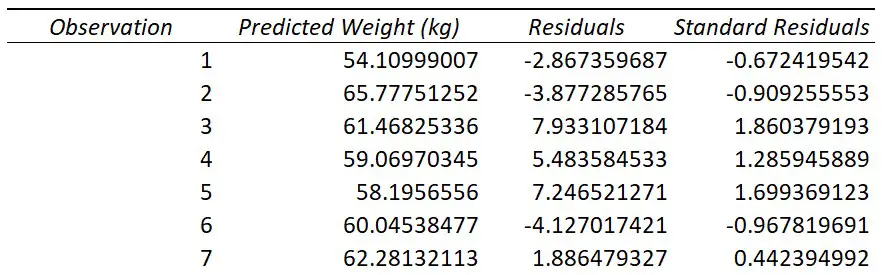
Residual Output
If you selected to have the Residuals option during the regression set-up, you will have a table titled Residual Output.

For each observation from your data that was entered into the regression test, you will get a predicted value of Y based on the regression model.
For example, if you look at the first observation in my original data, you see this participant had a height of 167.08 cm. If I put this into the regression equation, along with the slope and intercept values, I get the predicted weight value of 54.10999 kg.
This is what the Predicted column represents; Excel does this for each of the observations.
Using the predicted values, Excel can then calculate the residuals.
A residual is simply the distance between the actual data point and the line of best fit.
For my first participant they had a height of 167.08 cm and a weight of 51.24 kg. As calculated above, the predicted weight value based on the model was 54.10999 kg. The residual for this point therefore is the difference between the actual weight value (51.24 kg), and the predicted weight value (54.10999 kg), which comes out at around -2.867 kg.
Excel then repeats this process for the rest of the observations.
Residual Plot
If you also selected the Residual Plots option in the Regression set-up window, you will also get a graph returned.
Here is my Residual Plot.

This is a scatter plot of the residuals on the Y axis and the values of the independent variable on the X axis.
Residual plots are useful to look at when investigating homogeneity of variance, which is an assumption of the linear regression test.
What you are looking for here is a random pattern to the graph; there should be roughly half the number of data points above 0 and below 0, and there vertical spread of the data points should be roughly constant the further along the X axis you go.
Standardized Residuals
If you selected the Standardized Residuals option in the regression options, you will also see a column called Standard Residuals in the residuals table.
The standardized residual is the residual divided by an estimate of its standard deviation. You can think of them as Z scores.
These values are useful to look at when trying to identify potential outliers in your sample.
Generally, any standardized residuals with a value greater than 3 or -3 is a sign that it may be an outlier.
Line Fits Plot
If you selected to have the Line Fit Plots option, you will also see a scatter plot containing the data that was entered into the regression test.
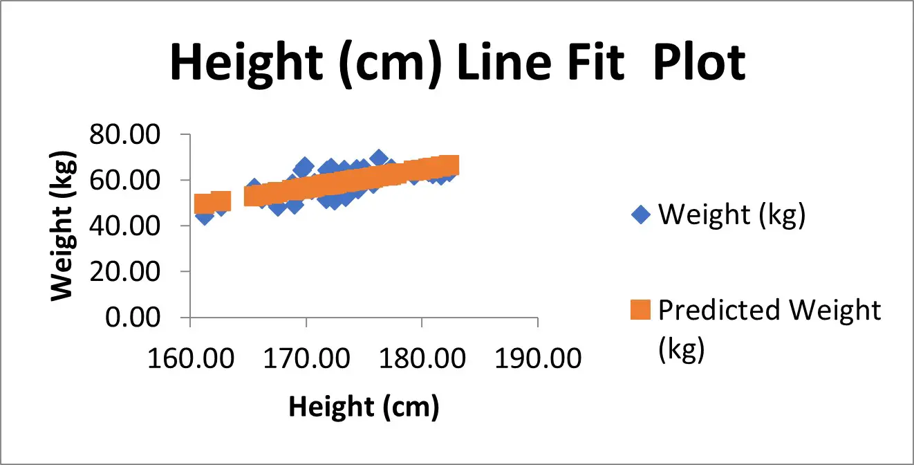
In my example, I have the height measures on the X axis and the weight measures on the Y axis.
There is also another set of data, as shown in orange here, which are in fact the predicted Y value based on the model. These are the Predicted values from the residuals table.
If instead of showing the Predicted values on the graph, but you instead wanted to plot the line of best fit (which will pass through the predicted values), then you could remove the predicted values from the graph.
To do this:
- Right-click on on the graph, and go to Select Data
- Highlight the predicted Y variable in the legend entry, select remove, and click Okay
- Select the graph, then go to Add Chart Element>Trendline, and select the Linear option
- If you also want to show the equation of the line, then double-click on the line
- Then, in the Format Trendline options that have opened to the right, scroll down and select Display Equation on Chart
Normal Probability plot
Finally, if you selected the Normal Probability plots option in the regression setup window, you will also see a table called Probability Output and a graph, called the Normal Probability Plot, which is a scatter plot of this data in the graph.
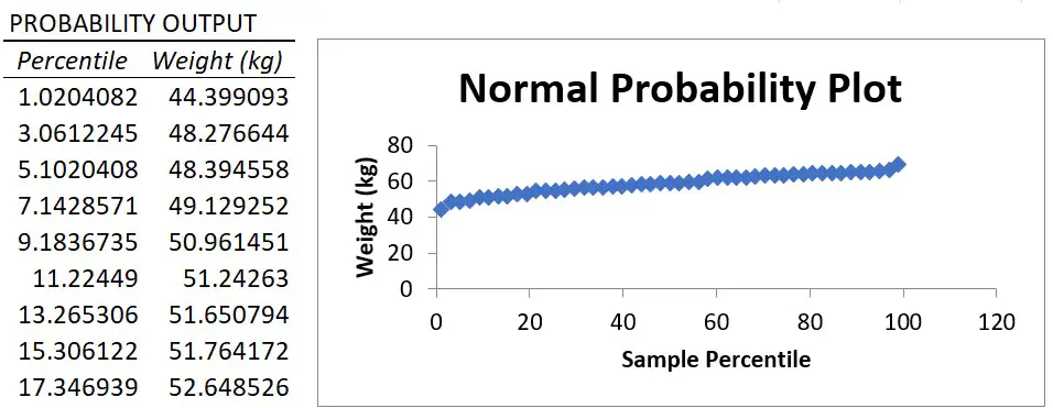
The X axis plots the percentile value ranging from 0 to 100 and the Y axis plots the Y variable data.
The normal probability plot is used to determine whether the data fits a normal distribution.
Essentially, what you are looking for is a straight line of data. And, as you can see, there is a nice straight line of data for my example, which suggests the weight data are normally distributed.
However, it’s worth noting that the Y variable does not actually have to be normally distributed when fitting a linear regression model. I’ll go into a bit more detail about the assumptions of linear regression in a future tutorial.
Wrapping up
You now know how to perform a simple linear regression test in Microsoft Excel, and how to interpret the output of results.
Microsoft Excel version used: 365 ProPlus

")
